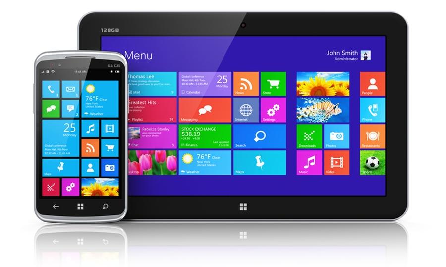
At the beginning of 2014 comScore reported that mobile usage (tablet/smartphone) had reached 55% of all internet usage worldwide. Given these statistics its hardly surprising that there has been a huge upsurge this year in webmasters either modifying an existing website to suit mobile devices or rebuilding one in a mobile responsive framework.
I have found that in many cases people have been rash in their decision making when it comes to approaching this task. On the one hand it is often sold as being a mammoth undertaking which scares people away. Inevitably webmasters are sourcing short-cut solutions which often only serve to make the user experience worse. My first piece of advice is to avoid these short-cut tools that propose to “mobilize your site for a small fee”, they simply don’t work!
The basic concept of responsive design is simply the use of flexible widths/heights so that elements can adjust fluidly to the window and ‘stack’ accordingly depending of the width of the browser. A completely responsive design will adjust even when a user minimises their window on a conventional screen. A good example of this is www.alpha1.ie, this site was developed recently by Echo Media in conjunction with Ecom-Ireland.
Here are a few tips for Mobile Responsive Development which I think should be considered when planning your approach.
- Do I need my site to be mobile responsive?Take a look at your analytic data to see what percentage of users access your site via their mobile device. This site is not mobile responsive simply because only 3% of users access it on a mobile device. There is work ongoing in the background to re-design this site with mobile in mind but there is time available to go through this process thoroughly. So I am suggesting that if you don’t need it urgently, don’t rush in.
- Make sure to design for mobile first. There are many sites I have seen in the past 12 months that were clearly designed for desktop with mobile responsiveness in mind. This approach is back to front. The limitations of a mobile device are much greater (e.g screen size, connectivity etc.) so if your layout accommodates this then you will have room to expand on your desktop version.
- Decide on a framework that meets your needs and allows for future development.Developers can determine the window width with JS/PHP etc. or a combination of both. If you are using server-side code only and the window is changed the page may have to be refreshed to determine its width again (which is not necessary with CSS3). CSS3 on the other hand can control this but it is worth keeping in mind that many of these CSS3 features are not a cross-browser solution (needless to say any IE version below 9 has a brain overload with @media screen etc.).
- What content is the most important?When creating your wire-frames be strategic about what content takes precedence because you will need to make decisions as to what content is vital and in what format. For example a pop-up image viewer may be a feature on your desktop site but this format is not appropriate for mobile. If its vital to have an image viewer you need to either source/write an appropriate module or simply find an alternative way to display images on your mobile version.
- Do I need to scale my images? This is a choice to be made in conjunction with Q.4. There are several methods now available using a combination of JS & PHP to achieve this (even scaling rotating banners) but webmasters should be aware of the CPU workload this requires if a site is heavy on imagery.
- “All looking great now – job done”. After introducing multiple CSS, JS & PHP scripts for the different variations your site is going to be slow to load. Be sure to use all compression techniques available to you (Gzip etc.) to minimise the load time particularity on the mobile device given its potential for slow connectivity. I would suggest using this Google Guide to speeding up your site. A few simple steps can improve the load time significantly and make browsing your site across various devices a more pleasant experience.
